The branding for Seal represents a deliberate shift away from traditional, dense engineering aesthetics toward a modern, approachable software identity. Because Seal functions as a spin-off from a highly technical laboratory planning company, its brand identity bridges the gap between deep industrial expertise and more modern design.
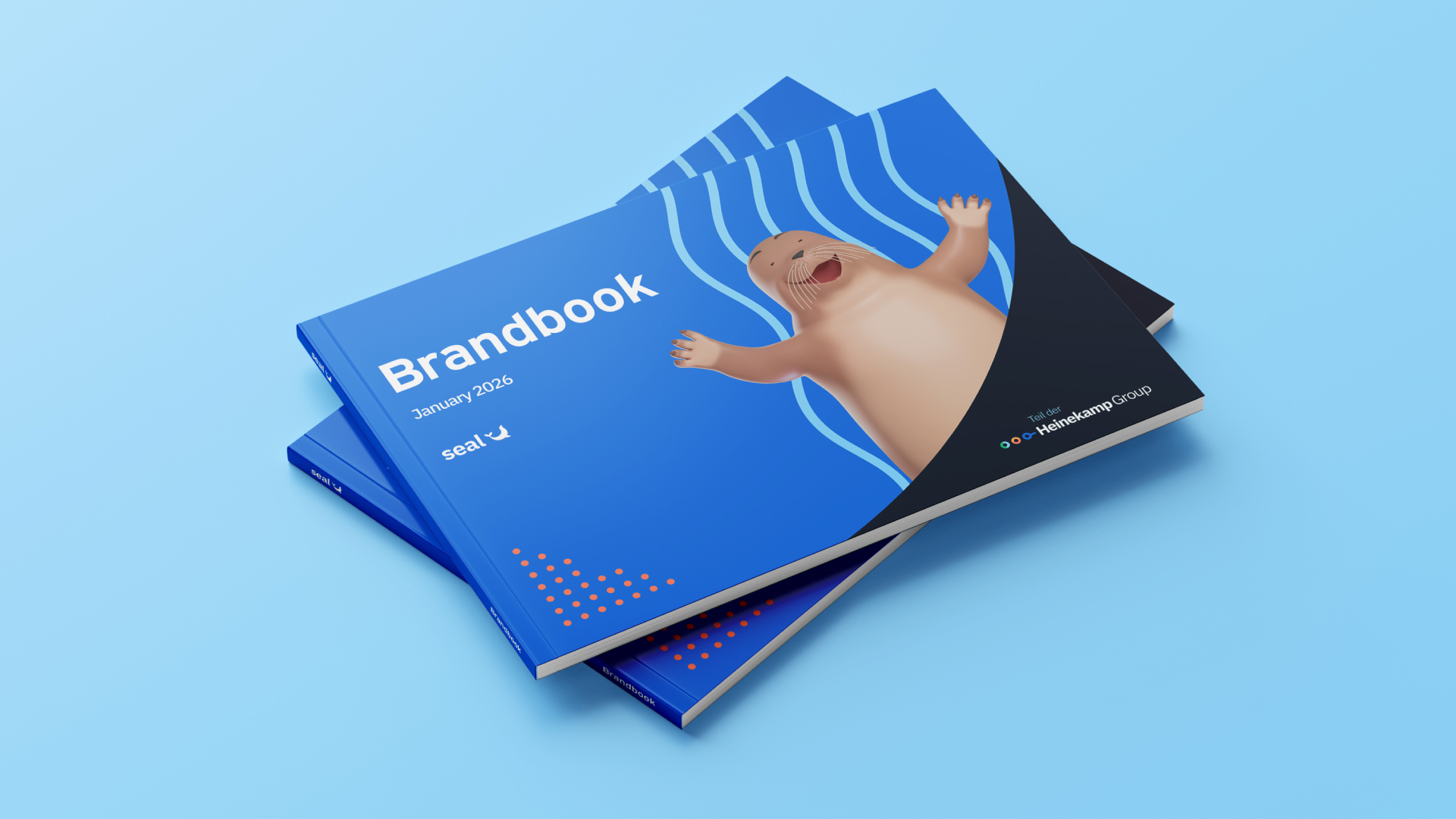
The challenge was to create and update the brand identity of the company. Although a basic ‘starter' brand was already in place, this was something that was quite corporate and didn’t really communicate the attitude of the brand, what Seal stood for or the quality of the product.
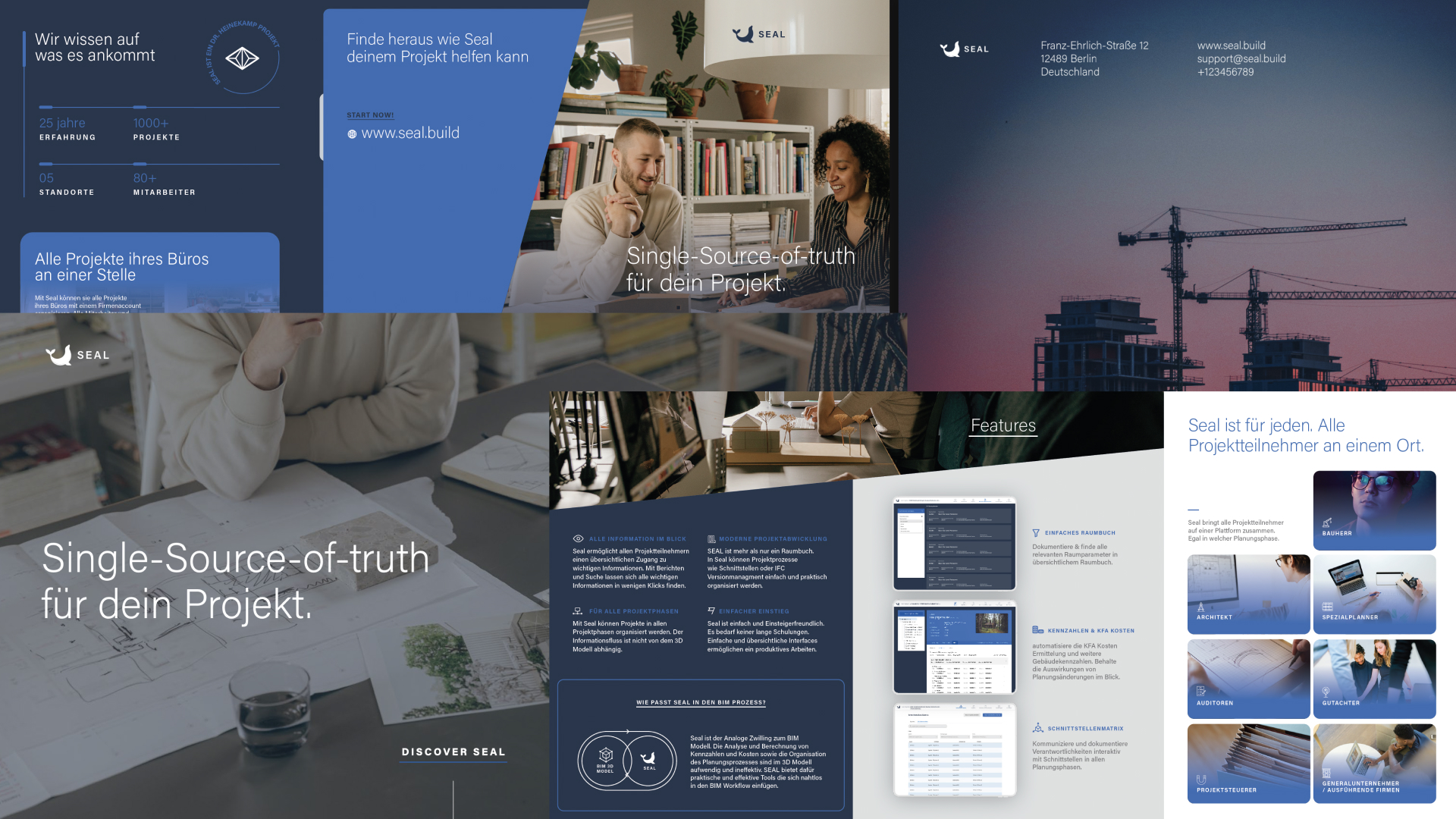
The existing Seal brand was quite cold and not that approachable. We wanted to be more of a disrupter, standing out from the bland. The logo icon itself was a solid foundation, so we set out to build a complementing and unique brand around it, as well as develop it further.
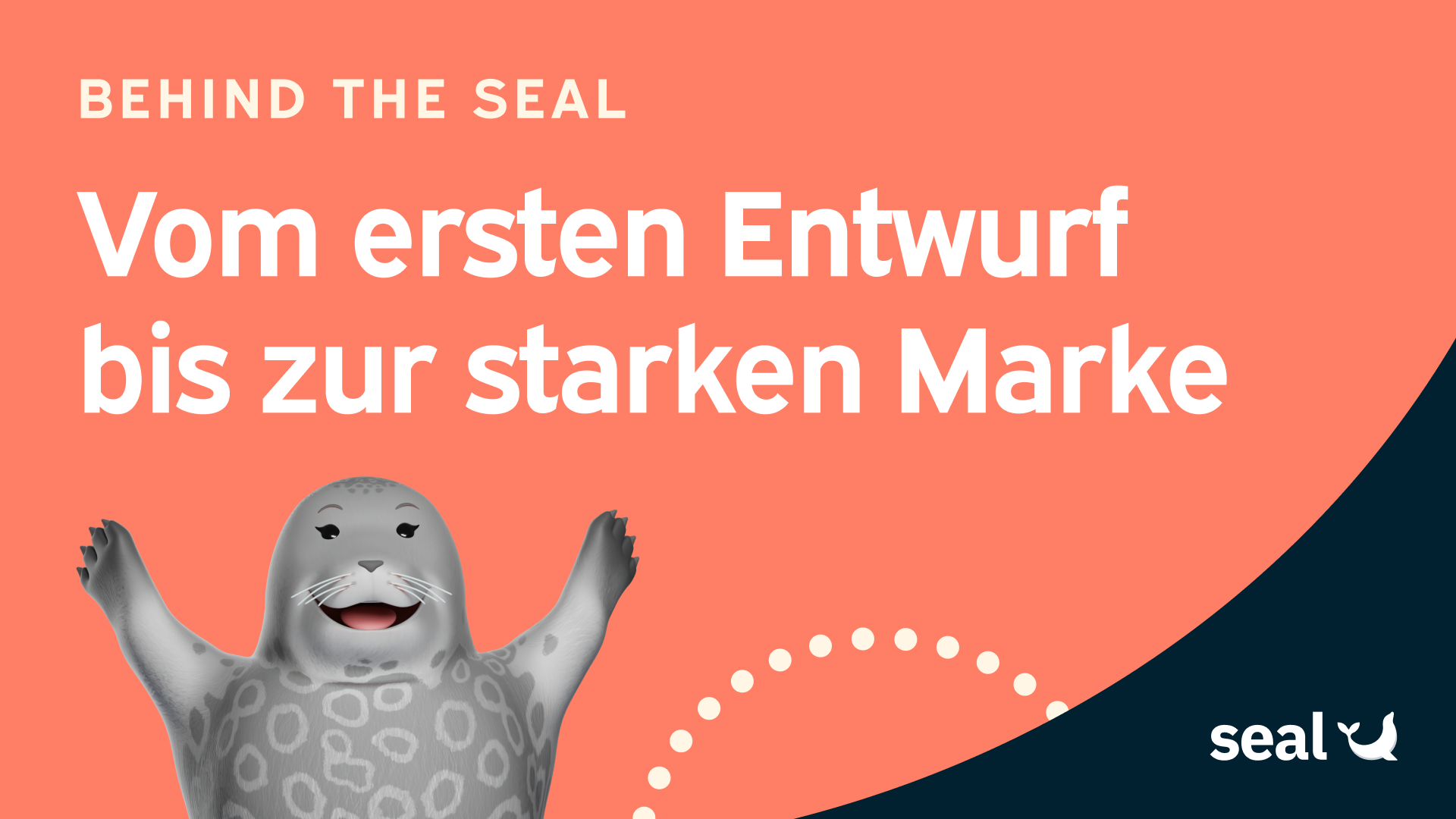
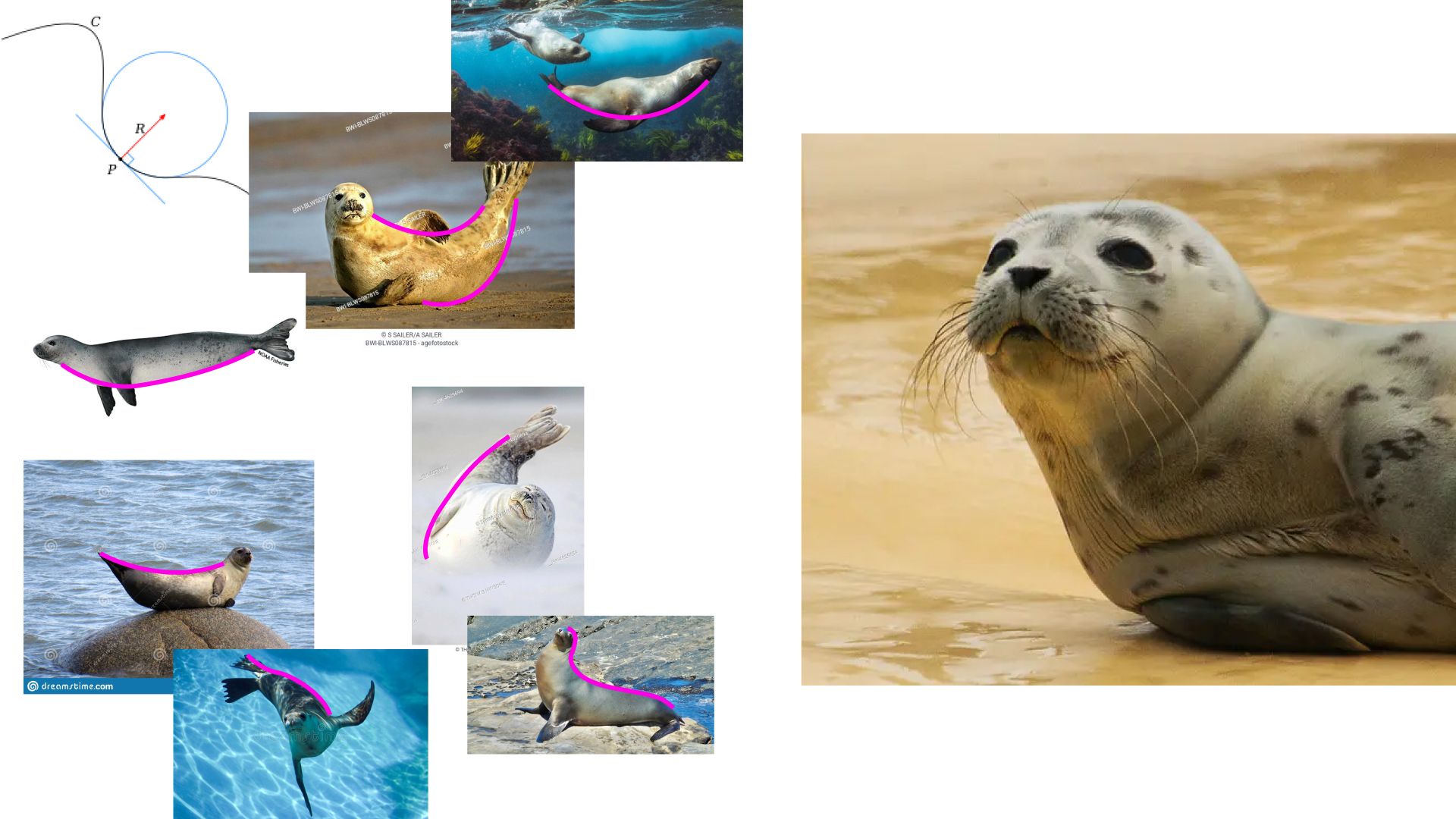
Early on we established that we wanted actual seals to become a big part of our brand, the kind of thing you wouldn’t necessarily expect to see in the world of construction. This meant taking inspiration from the lines of the animals themselves, primarily making use of curves and soft lines instead of straight and harsh angles.
Why seals? Because they embody exactly what counts in construction and on building sites: adaptability, strong communication skills, teamwork, perseverance, determination, and resilience – and the right instinct at the crucial moment. Qualities that make all the difference in the construction industry.
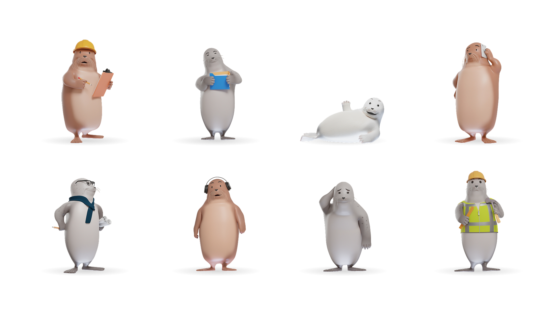
It was at this point that we also had a vision to represent each of our target audiences within the brand through the use of the animals, for example having an architect or construction worker seal, putting the users at the heart of the brand.
The existing colour palette was a sea of ‘safe’ blue, while maintaining a connection to Seal’s parent company Dr. Heinekamp, the Seal brand also needed to develop its own distinct personality. We began to look at various different habitats where seals live around the world for inspiration as well as their food and fur, which led to the creation of the colour scheme shown below. This palette still maintains shades of blue as primary colours for their trust signifying qualities as well as the connection to the parent company, but now they are supplemented by some more characterful and charming supporting shades.
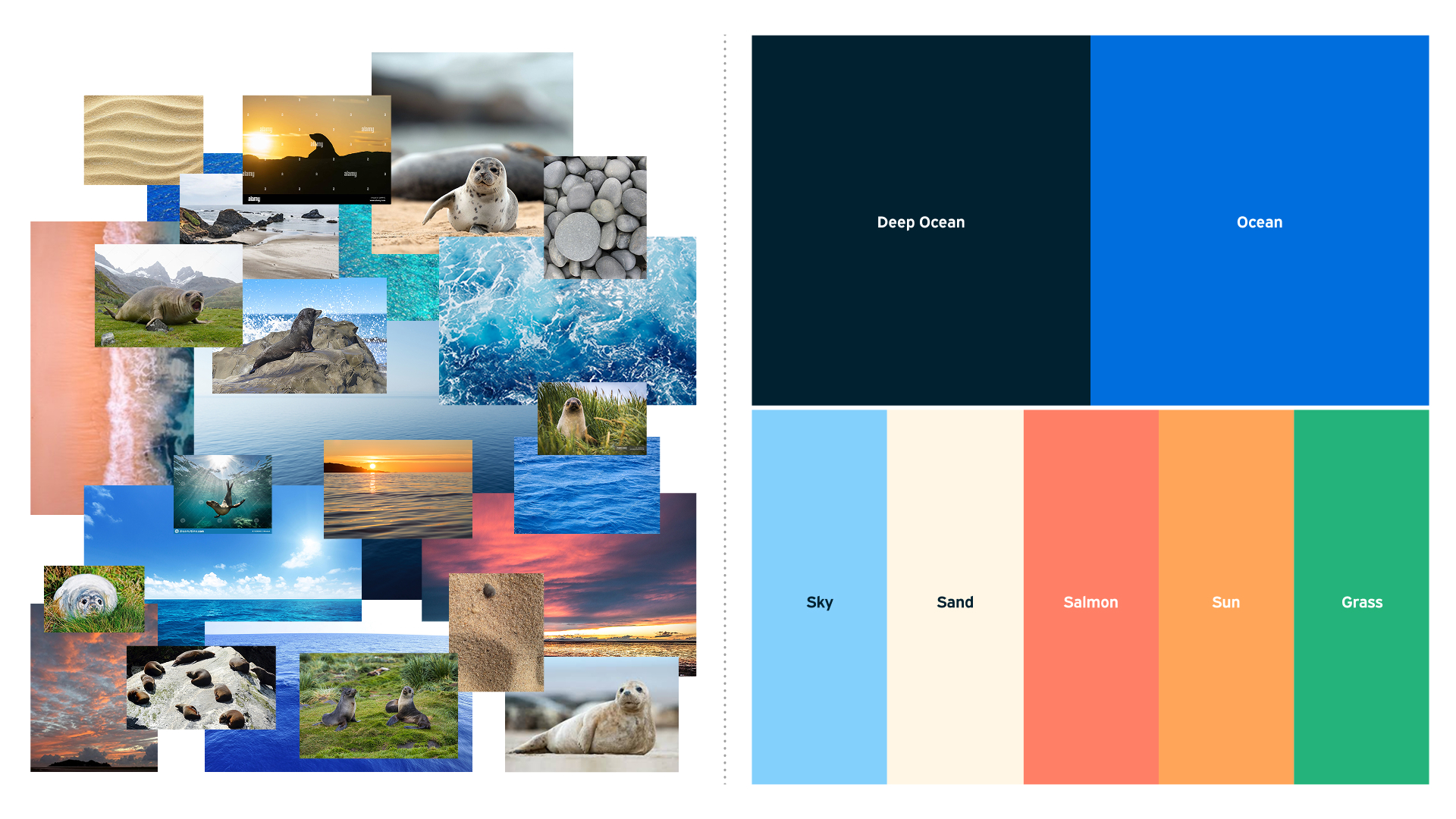
This colour palette has since now been developed and extended across the whole Heinekamp Group, albeit used with a different approach per brand - yet still further connecting the different strands of the business.
As mentioned previously, at Seal we visually and culturally lean into our seal animal characters to bring warmth and a sense of empathy to an otherwise rigid, grey construction industry.
We worked with Sam from ThreeDee to create a set of completely bespoke characters. We initially modelled a harbour seal, a bearded seal and a baby seal, each with their own gallery of poses and accompanying 3D props.
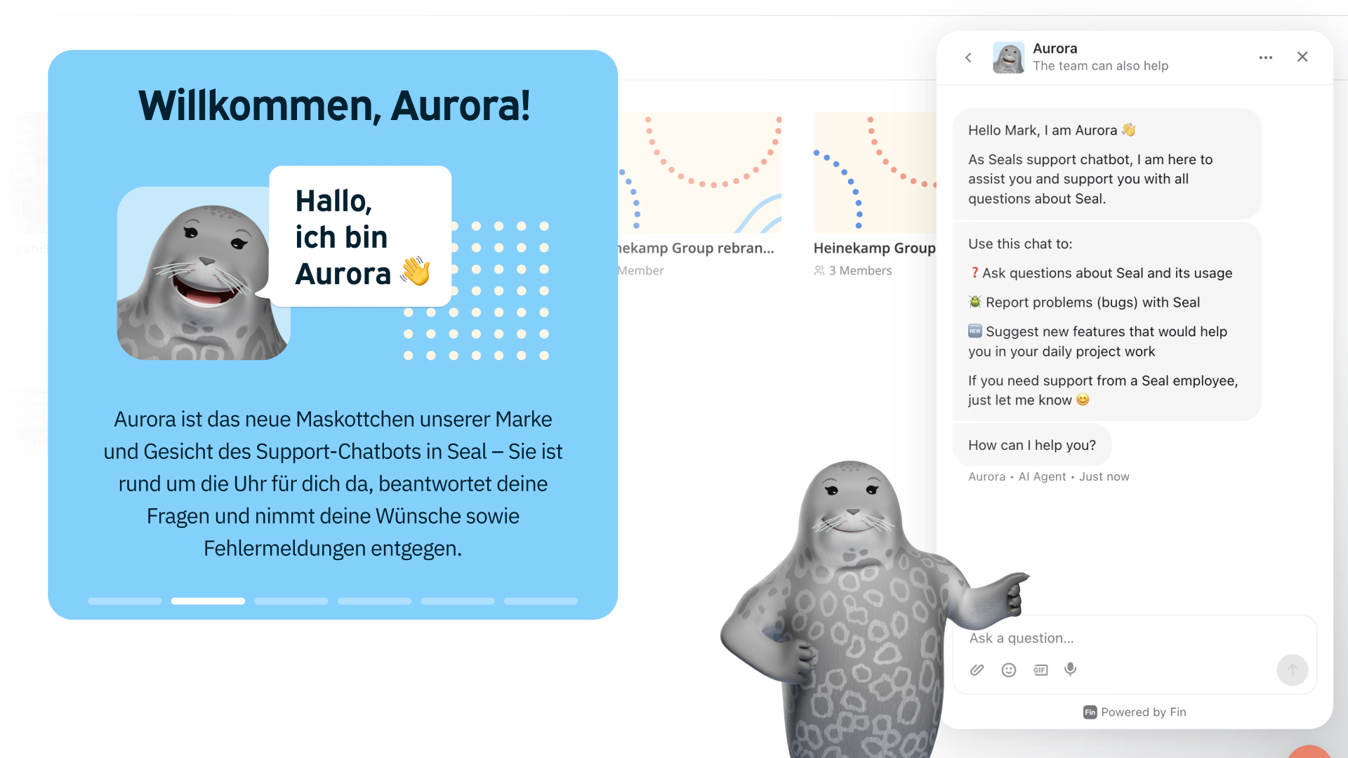
Since launch we have also developed Aurora, our ‘helper’ seal mascot who is the face of our customer support chatbot. Aurora embodies the tone of voice that we strive for, knowledgeable and precise, but entirely casual and supportive. She helps users understand Seal as a helpful digital assistant that supports them in planning and executing their construction projects.
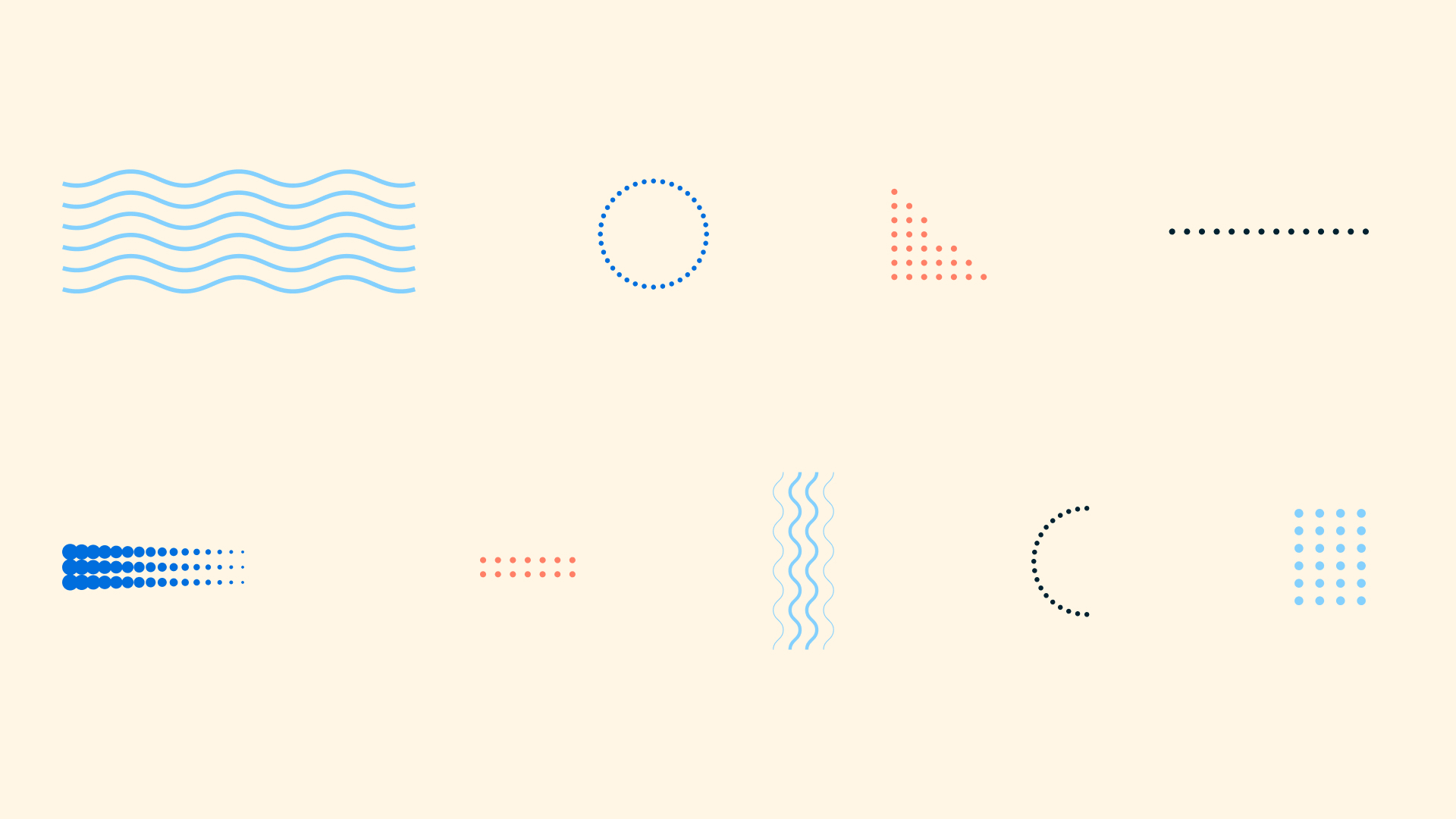
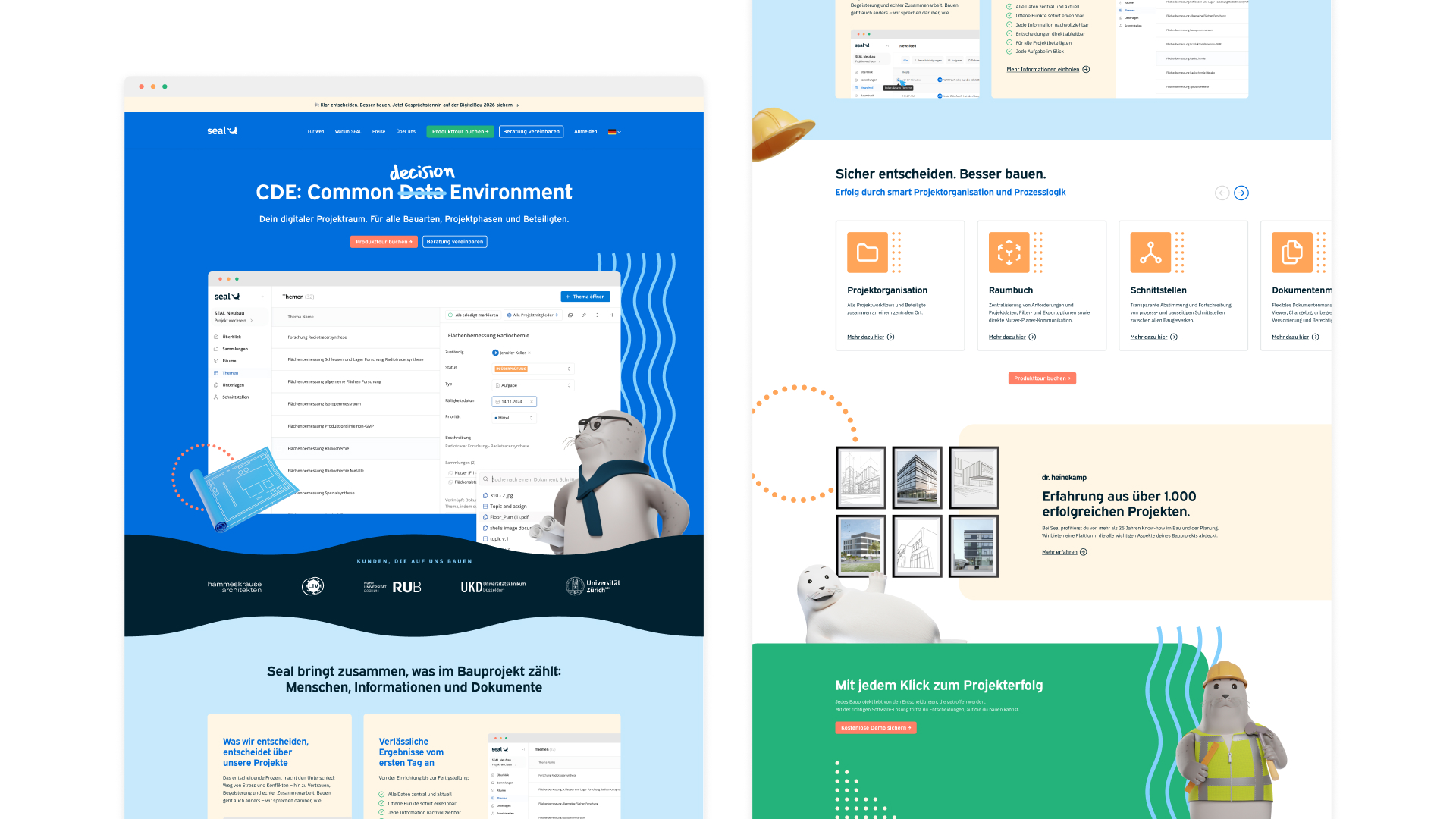
The final building blocks of the Seal brand are our playful graphic elements, which when used in conjunction with our joyous colour palette and friendly seal models create unmistakable Seal look which runs across all touch points, including the software itself.
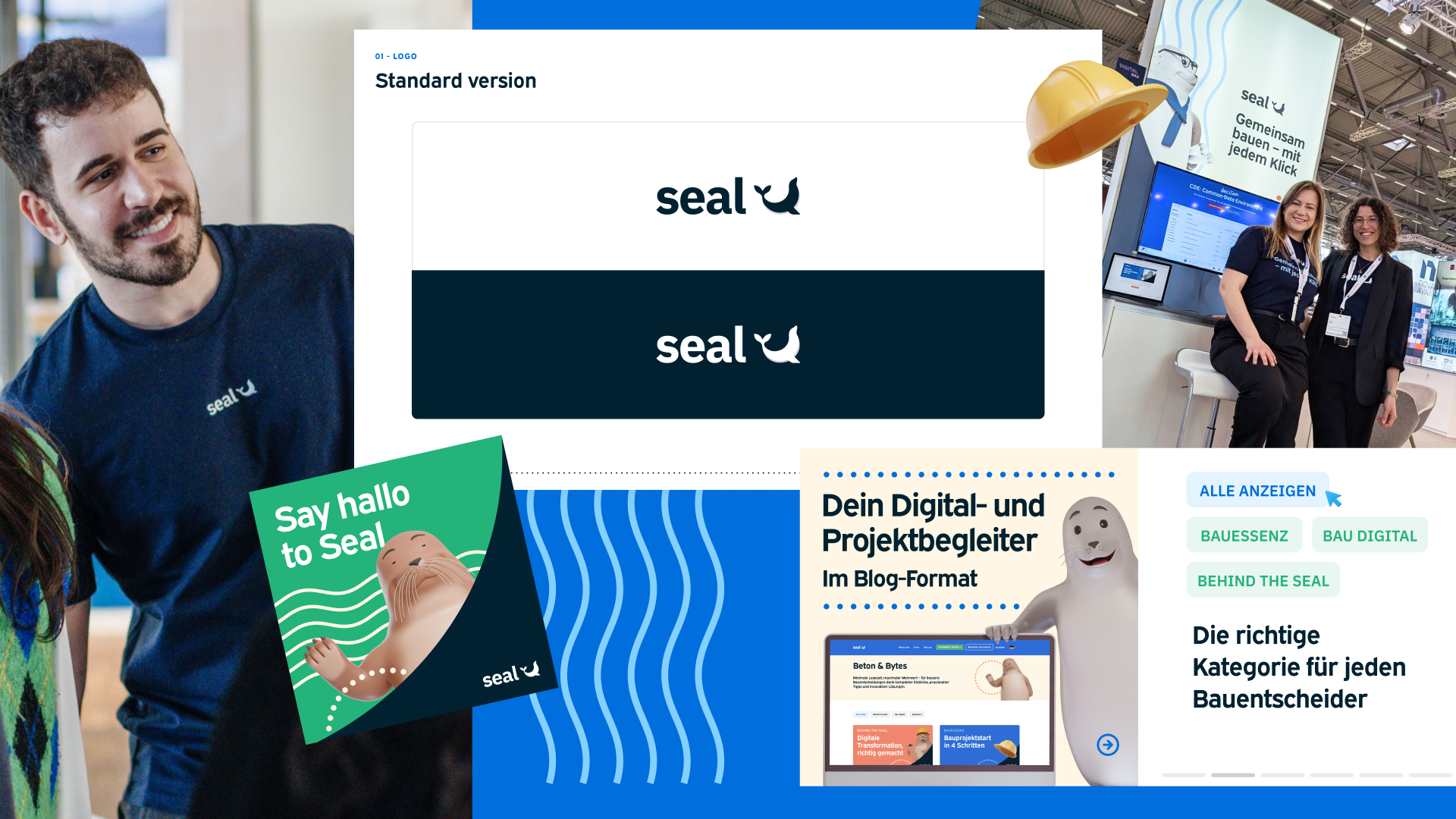
Since launch the Seal brand has been received very warmly within the industry. Our attendance at major conferences and such as digitalBAU and Lab Sample has allowed us to bring our seal mascots from the screen to connect with our target audiences.
We’re of course never finished with our branding and marketing initiatives though and have plenty more in the pipeline, including our very own soon-to-launch Seal podcast; ‘Brick by Brick’ – make sure you’re subscribed to our newsletter for the latest updates!
Thanks for reading!
Erhalte Einordnungen zu Branchenthemen, Praxisbeispiele, Produktentwicklungen und vieles mehr direkt in dein Postfach.



Seal / Dr. Heinekamp Labor und Institutsplanung GmbH
Gaußstraße 12
85757 Karlsfeld



.svg)